

FASHIONX REBRAND PACKET
SOLO PROJECT (COMISSIONED)
see slideshow of FULL rebrand packet below


This project was one that I took on voluntarily — actually, one that I asked to make.
I wanted to push myself and see just how well I could apply the knowledge I had learnt about what makes a cohesive brand identity. There were many things to keep in mind, since my main goal was to elevate FashionX from being a student-run club that looked and felt student-run, to a high-level Stanford enterprise that felt clean, professional, and ready to be taken seriously.
I applied my knowledge of information hierarchies, typeface pairing, color contrast-legibility-levels, and worked closely with the Presidents at the time to deliver new guidelines that they’d be excited for future marketing endeavors to follow. As such, this was not only a design exercise, but an exercise in managing client-designer relationships, too.
REBRANDED MARKETING MATERIALS
see examples of how I applied these new guidelines to marketing materials for FashionX


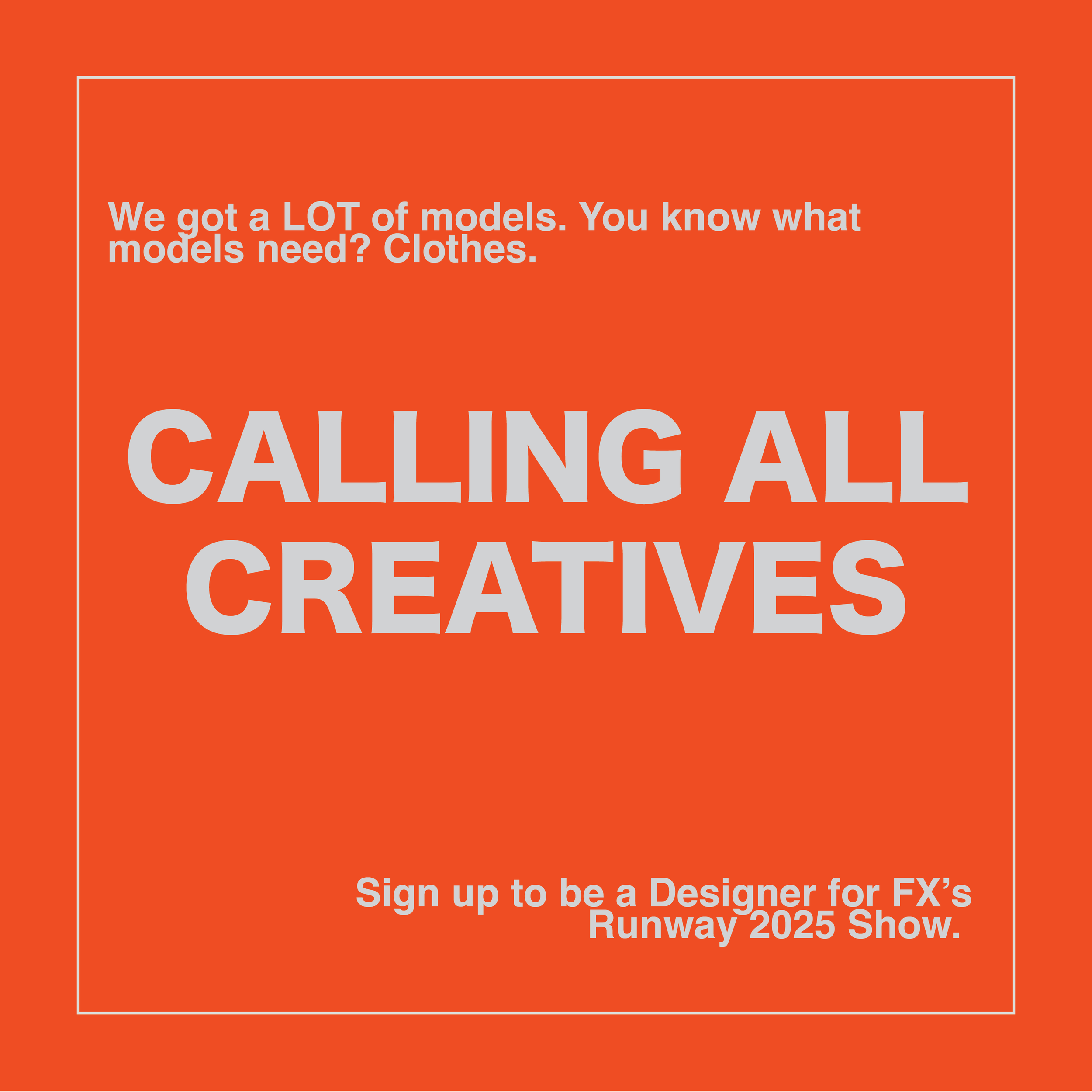


These assets and materials were used both in digital and physical promotions year-long - some I designed with poster-print in mind (such as the two directly above), others with social media aspect ratios in mind, and others I created duplicates of so they could fit either distribution route.
Why go through this trouble? Because it’s a designer’s job not only to make deliverables, but to ensure easy, efficient publication thereof for their clients. What use is a 16:9 poster, if FashionX had wanted to post them on Instagram?